Sometimes car designers may be swept over by passion or a little too much alcohol the night before, resulting in outrageous designs. The dashboard is one such part of the car that requires a detailed thought process in designing all the tiny nooks and corners. While some designers try adding a futuristic touch, they may not quite know when to stop. Here are some of the most outrageous dashboard designs from thehistory of cars.
2002 Fiat Multipla
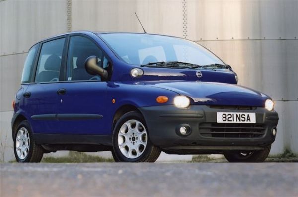
Image Source : Images.Honestjohn.Co.Uk
Voted ‘Family car of the year’ four years in a row from 2001-2004, this model had no aesthetic value whatsoever. With a horribly designed exterior, the car’s interior boasted an equally bad looking dashboard. With theangular positioning of multiple things together in the center of the dashboard, the dashboard looked incredibly unattractive for a car that ranked so high in Top Gear Magazine for four consecutive years.
1981 Citroen Xenia Concept
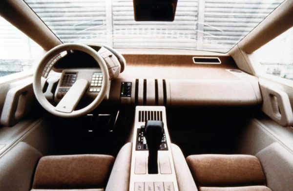
Image Source : Citroenet.Org.Uk
The Citroen Xenia Concept never went past its scale model design and thankfully remained only a concept. The makers had tried to make the car futuristic but their attempts look futile when you see the dashboard. With a slew of lights and buttons in and around the steering wheel, the dashboard looked poorly designed. The concept was thought to have anautomatic gearbox and an open-air ambiance with large glasses on all its four corners.
1972 Maserati Boomerang concept
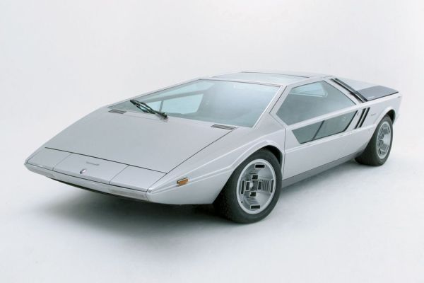
Image Source : CarDesignNews.Com
In its 1972 concept, the team behind Maserati Boomerang took every instrument, button, and utility it could find on the dashboard and kept it inside the steering wheel. The non-functional model was first displayed at Turin Motor Show in 1971. March 1972 saw the model completely operational thanks to the mechanics at Maserati. A race-bred V8 engine of 4.7 liters was used as the engine, which could develop 310 horsepower energy and had a top speed of 300km/hr.
Camaro Berlinetta
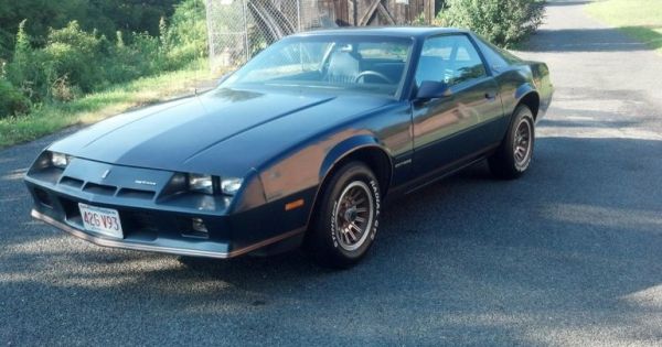
Image Source : Assets.NydailyNews.Com
Makers of the car thought to create a futuristic design and ended up making a ridiculous dashboard. With lots of buttons, most of which have a solid chance of holding no function, the dashboard also has a rotating pedestal. Why, you ask, to mount the music system and rotate it on a single axis.
1988 Pontiac Banshee
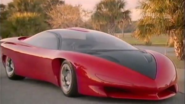
Image Source : 95Octane.Com
The concept car was actually a great representation of the possibilities that could be incorporated into a car design. A blend of the 1988 and 2008, the Pontiac Banshee had high-tech gadgetry and a number of convenient features including a head-up display. The only issue was the technology that existed at the time it was built. All the gauges had to be electronic and the head-up display is a 3-D display device.
1982 Lancia Orca
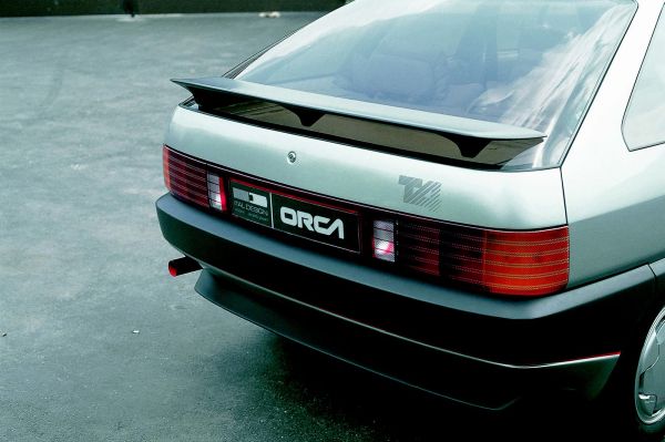
Image Source : Carstyling.Ru
The car introduced a digital dashboard way before its time, but the brightly colored and uncoordinated placement of so many instruments close to the steering, make the dashboard unpleasant. Coming with a giant manual of what the buttons were intended to do, the dashboard looked like a glorified ATM with a card swipe installed next to it.
2012 PaganiHuayra
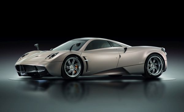
Image Source : Cardotcom.Com
A million dollar car does not necessarily have to look like it just walked out after robbing a jewelry shop. While some actually like the brightly colored chrome and sparkle-lit interior and dashboard, many do not.
1984 Aston Martin Lagonda
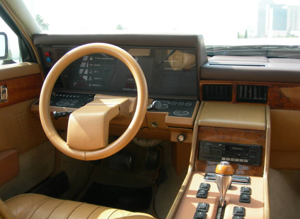
Image Source : MomentCar.Com
The strangest and longest exterior got teamed with the most uncomfortable looking interior in this car. Maybe this is what designers back then envisioned the future to look like, or maybe they just wanted to be innovative. The boxiest dashboard you can ever come across is in this car.
Dashboards have seen aninteresting evolution over years, from trying to be futuristic to mimicking. Many designers tried to mimic what they saw in sci-fi movies and instead created dashboard Frankensteins.


